Color Image to Grayscale (Monotone)
Processing
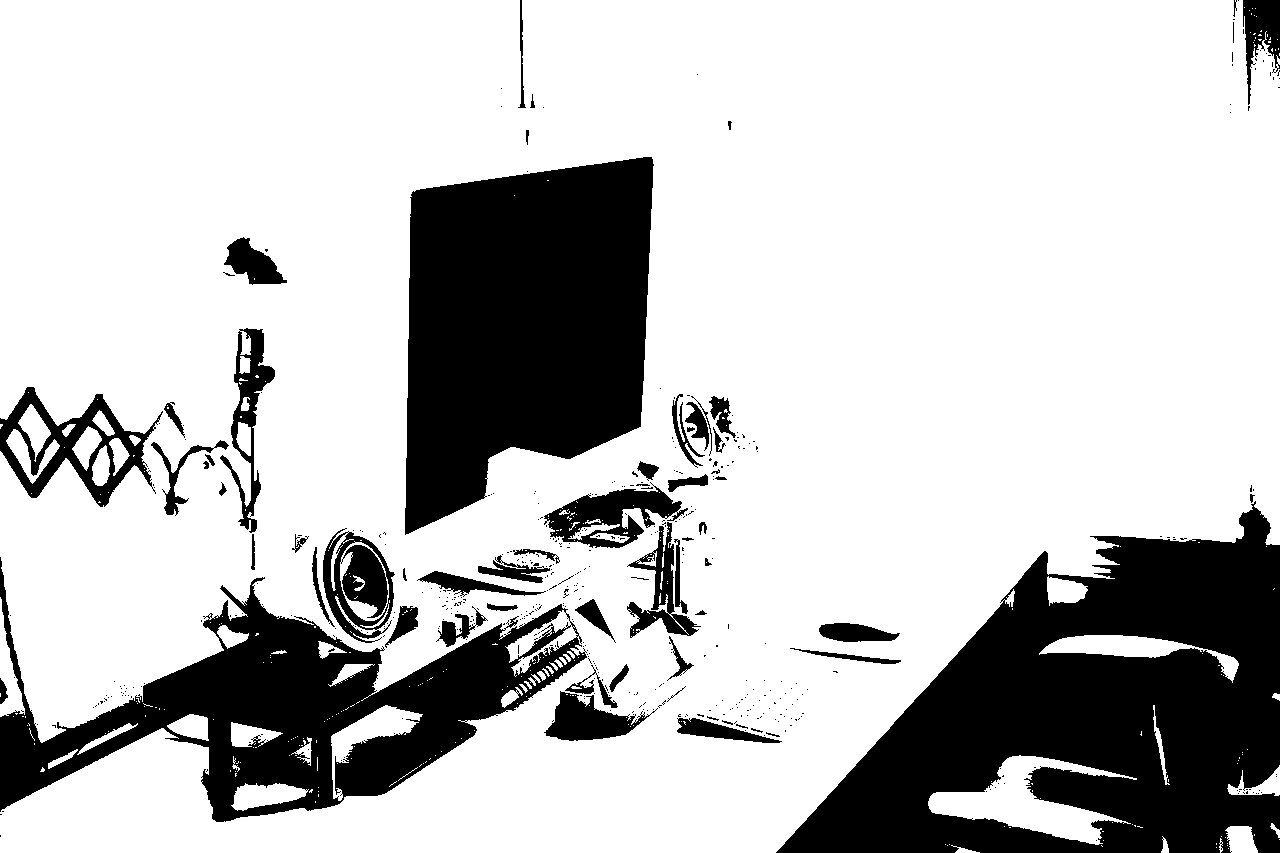
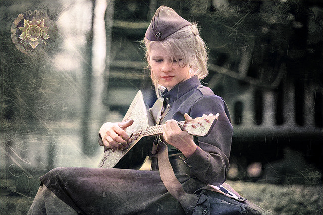
Sample Before
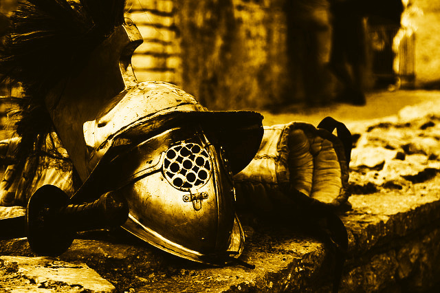
Sample After

Original Image

Default Grayscale
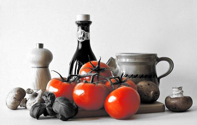
Isolate Red
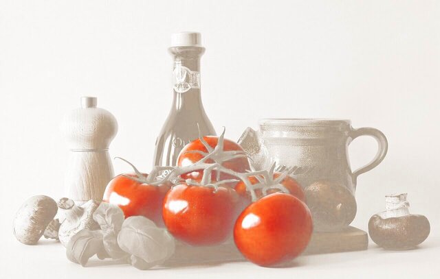
Fill■ x Isolate■
About This Feature
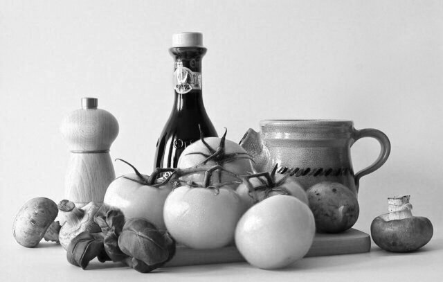
On this page, you can convert your uploaded images to black and white (grayscale) versions online.
By using the default settings, your images will be transformed into a common grayscale appearance.
Additionally, you can customize the following settings to create more unique and stylish images according to your preferences:
Brightness: Adjust the intensity of ambient light.
Contrast: Higher contrast results in more pronounced shadows.
Fill Color: Choose from more than just black and white, such as sepia tones, to create a monotone image.
Isolate one color: Convert the image to grayscale but keep the original color of a specific area, such as red. You can specify the color and range to be preserved.
Output Format: JPEG/PNG/WebP/GIF/BMP/TIFF
Supported input file formats are JPEG, PNG, GIF, BMP (bitmap), WebP, ICO, and TIFF.
How to Use
-
1Choose Your ImageClick the "Browse" button or drag and drop an image onto the screen.
-
2ConvertClick the "CONVERT FOR FREE" button.
-
3DownloadClick the "DOWNLOAD" button.
DataChef Features

Easy and Free
Unlimited conversions for free.
No technical knowledge required.
Intuitive and user-friendly operation.
No technical knowledge required.
Intuitive and user-friendly operation.

No Registration Required
Available immediately after access.
Can be used without registering personal information.
Can be used without registering personal information.

Safe and Secure
Fully SSL encrypted communication.
Automatic file deletion by clicking "download".
Automatic file deletion by clicking "download".

Fast
High-speed site access
and rapid file conversion.
and rapid file conversion.
No Watermark
No watermark.
No attribution required.
No attribution required.

Commercial Use Available
Free for commercial use.
No need to contact us for commercial use permission.
No need to contact us for commercial use permission.
About Each Setting
■Brightness
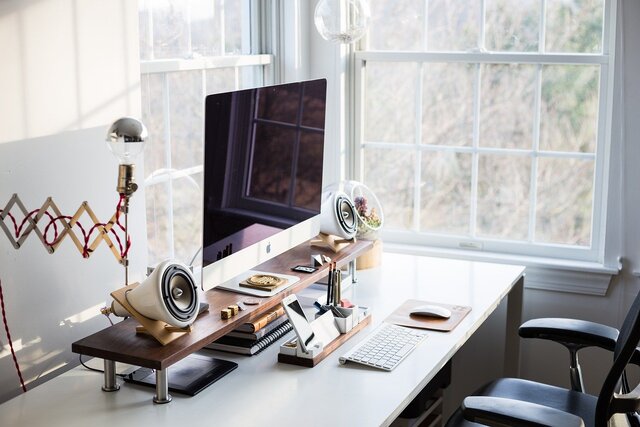
Original Image
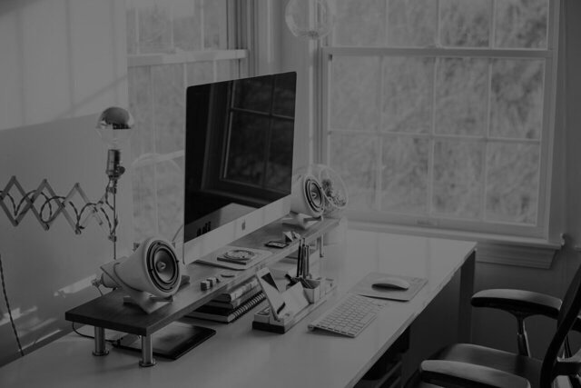
Brightness: -50

Brightness: ±0
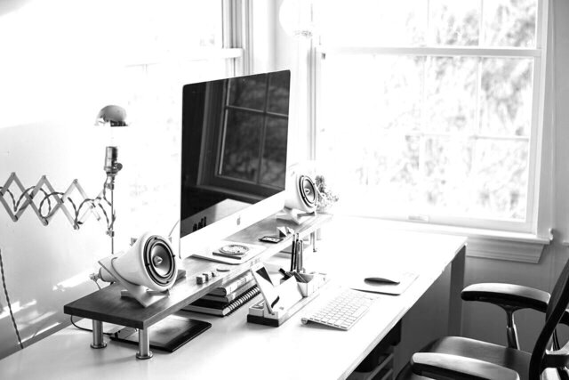
Brightness: +20
You can adjust the strength of the ambient light. It is similar to changing the "exposure" setting on a camera.
Automatic optimization through auto adjustment is also possible.
If you are to overlay text, it will be easier to read if the image is darker when the text color is bright, and if the text color is dark, the image should be brighter.
You can also change the brightness by selecting a light/dark color in the "Fill Color" setting, which is another option.
■Contrast

Original Image
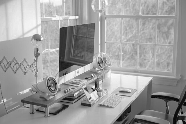
Contrast: -30
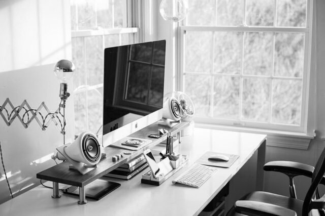
Contrast: ±0
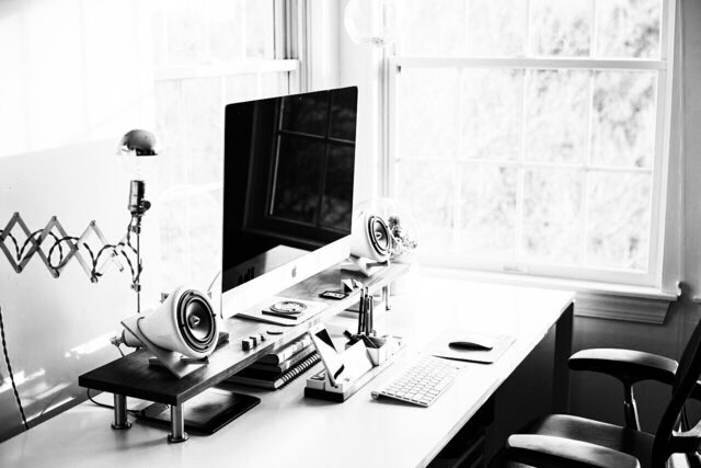
Contrast: +30
Higher contrast settings make the differences between light and dark areas more apparent, while lower contrast settings result in a more subtle impression.
Automatic correction can also be used to optimize the image.
If you want to put text on the top of the image, it is recommended to lower the contrast level to make the text easier to read.
■Shading Priority
Examples Where "Color-Intensity-Based" Grayscale Is Suitable
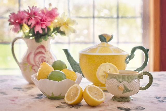
Original Image
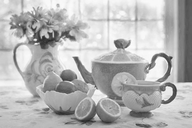
Prioritize "Color intensity"
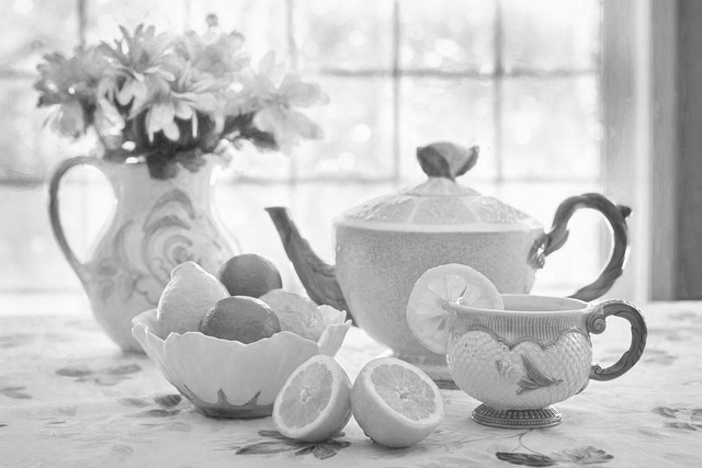
Between the two
(Default setting)
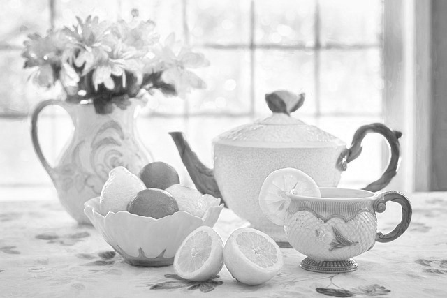
Prioritize "Light intensity"
Examples Where "Light-Intensity-Based" Grayscale Is Suitable
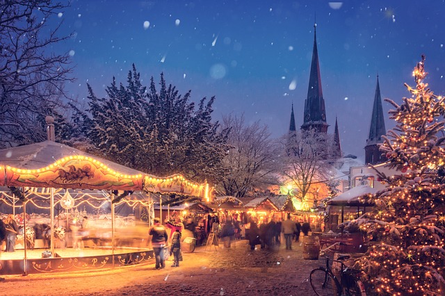
Original Image
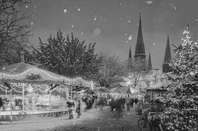
Prioritize "Color intensity"
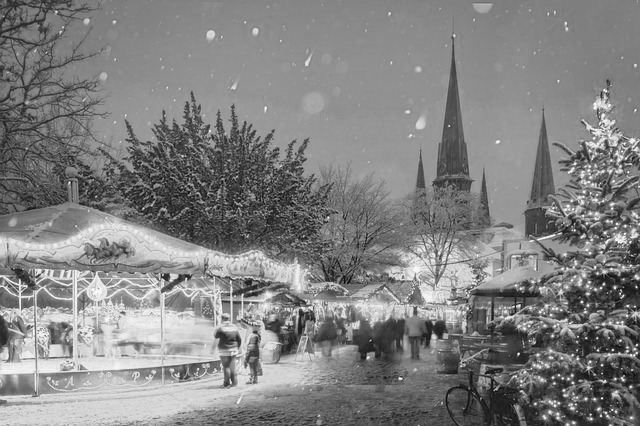
Between the two
(Default setting)
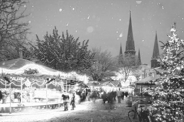
Prioritize "Light intensity"
When converting a color image to grayscale, you can set how much the conversion should be "Color-Intensity-Based (Lightness-based)" or "Light-Intensity-Based (Brightness-based)".
- Prioritize "Color intensity" :
When "Color Intensity" is given priority in conversion, the higher the color intensity of the image, the darker the image will be, and the lower the intensity, the whiter the image will be.
This conversion is suitable for images where you want to give a sense of the original color, such as a photograph of colorful flowers.
- Prioritize "Light intensity":
When "Light Intensity" is given priority, luminous or illuminated areas are rendered white, while areas that are not illuminated but in shadow are rendered black.
This conversion is suitable for illuminations and other shiny subjects, or when you want to emphasize the shiny areas that are illuminated by light.
- Selecting between the two approaches:
Whether to prioritize "Color Intensity" or "Light Intensity" when converting to grayscale depends on the image's characteristics and the desired atmosphere.
Opt for a grayscale that conveys color or one that conveys light, depending on your preference.
The default setting balances both criteria, resulting in a more convincing image that resembles a realistic sketch, allowing for the original color and light to be imagined.
Whichever criterion is chosen, trial and error is required. Since the impression of the image can change dramatically, try several different setting values by moving the slider left or right to create a grayscale image that is exactly as you imagined and feels right.
■Fill Color

Fill Color■ (default)

Fill Color■
Fill Color■
Fill Color■
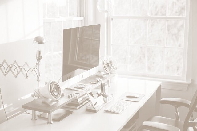
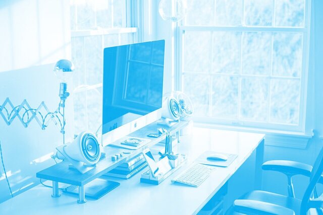
"Fill Color" is a setting option that is similar to choosing which color ink is used to print an image.
By default, the image will be a common black and white image, but by changing the "Fill Color," it can be made into a monotone image with a different color tone, such as brown (sepia) or blue.
Not only hue, but you can also select from all colors, including bright/dark shades, vivid/pale colors, and more.
For an easy and stylish look, we recommend choosing colors from the preset swatches in the color palette.
■Isolate one color
Original image
Isolate one color: Off(default)

Isolate color■

Isolate Color■ x Fill Color■
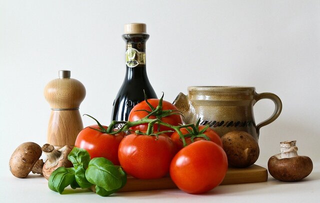
It is possible to process the entire image to grayscale but leave only the red color as is. You can choose which color to keep from among all colors, not just red.
That kind of image processing is called color isolation.
- The "Color"
Observe the subject's color in the original image carefully and set the appropriate isolate color.
The subject you want to preserve color has areas that are well lit and highlighted, and areas that are in shadow and dull.
Select a color in the middle of the two areas to preserve the color beautifully.
- The "Color Range"
If the subject's color looks grayish and unnatural, increase the "Color Range" setting value.
If the color remains in unintended areas, decrease the "Color Range" value.
■Output Format
You can select from the following formats:
JPEG/PNG/WebP/GIF/BMP/TIFF
By default, the extension is the same as that of the original image.
About Each Setting
■Brightness

Original Image

Brightness: -50

Brightness: ±0

Brightness: +20
You can adjust the strength of the ambient light. It is similar to changing the "exposure" setting on a camera.
Automatic optimization through auto adjustment is also possible.
If you are to overlay text, it will be easier to read if the image is darker when the text color is bright, and if the text color is dark, the image should be brighter.
You can also change the brightness by selecting a light/dark color in the "Fill Color" setting, which is another option.
■Contrast

Original Image

Contrast: -30

Contrast: ±0

Contrast: +30
Higher contrast settings make the differences between light and dark areas more apparent, while lower contrast settings result in a more subtle impression.
Automatic correction can also be used to optimize the image.
If you want to put text on the top of the image, it is recommended to lower the contrast level to make the text easier to read.
■Shading Priority
Examples Where "Color-Intensity-Based" Grayscale Is Suitable

Original Image

Prioritize "Color intensity"

Between the two
(Default setting)
(Default setting)

Prioritize "Light intensity"
Examples Where "Light-Intensity-Based" Grayscale Is Suitable

Original Image

Prioritize "Color intensity"

Between the two
(Default setting)
(Default setting)

Prioritize "Light intensity"
- Prioritize "Color intensity" :
When "Color Intensity" is given priority in conversion, the higher the color intensity of the image, the darker the image will be, and the lower the intensity, the whiter the image will be.
This conversion is suitable for images where you want to give a sense of the original color, such as a photograph of colorful flowers. - Prioritize "Light intensity":
When "Light Intensity" is given priority, luminous or illuminated areas are rendered white, while areas that are not illuminated but in shadow are rendered black.
This conversion is suitable for illuminations and other shiny subjects, or when you want to emphasize the shiny areas that are illuminated by light. - Selecting between the two approaches:
Whether to prioritize "Color Intensity" or "Light Intensity" when converting to grayscale depends on the image's characteristics and the desired atmosphere.
Opt for a grayscale that conveys color or one that conveys light, depending on your preference.
The default setting balances both criteria, resulting in a more convincing image that resembles a realistic sketch, allowing for the original color and light to be imagined.
Whichever criterion is chosen, trial and error is required. Since the impression of the image can change dramatically, try several different setting values by moving the slider left or right to create a grayscale image that is exactly as you imagined and feels right.
■Fill Color

Fill Color■ (default)

Fill Color■

Fill Color■

Fill Color■
"Fill Color" is a setting option that is similar to choosing which color ink is used to print an image.
By default, the image will be a common black and white image, but by changing the "Fill Color," it can be made into a monotone image with a different color tone, such as brown (sepia) or blue.
Not only hue, but you can also select from all colors, including bright/dark shades, vivid/pale colors, and more.
For an easy and stylish look, we recommend choosing colors from the preset swatches in the color palette.
■Isolate one color

Original image

Isolate one color: Off(default)

Isolate color■

Isolate Color■ x Fill Color■
It is possible to process the entire image to grayscale but leave only the red color as is. You can choose which color to keep from among all colors, not just red.
That kind of image processing is called color isolation.
- The "Color"
Observe the subject's color in the original image carefully and set the appropriate isolate color.
The subject you want to preserve color has areas that are well lit and highlighted, and areas that are in shadow and dull.
Select a color in the middle of the two areas to preserve the color beautifully. - The "Color Range"
If the subject's color looks grayish and unnatural, increase the "Color Range" setting value.
If the color remains in unintended areas, decrease the "Color Range" value.
■Output Format
You can select from the following formats:
JPEG/PNG/WebP/GIF/BMP/TIFF
By default, the extension is the same as that of the original image.


