
Choose how to enter your data. "From raw data" builds a frequency distribution table from a list of values you paste, and "From a frequency table" lets you type in the lower limit, upper limit and frequency of each class of a table you already have.
Table of Contents
-
What you can do on this page
-
What is this calculation used for?
-
How to Use
-
Formulas and graph
-
Symbols and terms
-
Good to know before you start
-
How to calculate it in Excel
-
How to calculate it in Google Sheets
-
How to calculate it in Python
-
How to write it in LaTeX and other math languages (copy and paste)
-
How to have ChatGPT do the calculation
-
DataChef Features
-
Related Features
-
NumberChef Calculators List
What you can do on this page
- Paste raw data such as heights, test scores or commute times (separated by commas or spaces), choose the class width and the lower limit of the first class, and a frequency distribution table (class, midpoint, frequency, relative frequency, cumulative frequency, cumulative relative frequency) is made for you
- You can also enter an existing frequency table (lower limit, upper limit and frequency of each class) directly
- The mean estimated from the class midpoints ("sum of (midpoint × frequency) ÷ total frequency") is shown both as a fraction in lowest terms (exact) and as a decimal. The mode and the class containing the median are found too
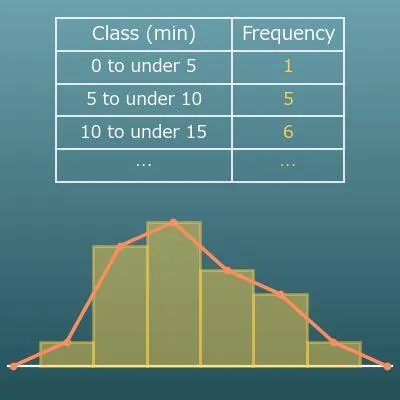
- A histogram and a frequency polygon are drawn automatically, and you can save them as PNG or SVG
- A plain-language guide to terms such as class, frequency and relative frequency, and copy-and-paste formulas for Excel, Google Sheets and Python are all on this page
What is this calculation used for?
Frequency tables and histograms of test scores grouped every 10 points are a standard part of grade reports. Even with the same average of 60 points, a single peak around 60 and two peaks in the 30s and the 90s describe completely different groups of students.
Turn the counts into relative frequencies, and you can fairly compare the distributions of groups of different sizes, such as two sections or two grade levels. The charts on standardized test score reports that show which band your score falls in are built on the same idea of a frequency distribution.
The histogram is one of the "seven basic tools of quality" used in manufacturing quality control. Measure the size or weight of products and make a frequency distribution, and you can see the center and the spread of the variation, and whether it is drifting toward the upper or lower specification limit.
If the distribution splits into two peaks, it may mean that two machines are set differently. The shape gives clues for finding the cause of defects.
The US Census Bureau publishes the population by age group and household income in brackets (such as "$50,000 to $74,999") in the form of frequency tables. For lopsided data such as income, a few large values are known to pull the mean above the median, so an "average income of X dollars" alone can give you the wrong idea.
A frequency table also shows which bracket has the most households (the modal class) and which bracket the middle household is in (the class containing the median), so you can judge from the whole picture of the distribution.
In weather and climate work, observed rainfall and temperature data are grouped into classes, for example "how many days a year had 1 inch of rain or more". A frequency distribution makes it possible to compare trends between years or regions, and to see changes in how often the extreme classes occur.
Disaster planning is built on this kind of distribution information: how strong an event is, and how often events of that strength happen.
At a checkup, a child's height and weight are plotted on the CDC growth charts, which show percentiles, such as "taller than 75% of children of the same age". Those charts start from the distribution of measurements of many children, and a percentile is the same idea as the cumulative relative frequency: the share of all the data below a value.
The reference ranges for height, weight, blood pressure and other checkup results also start from studying the distribution of data from many people.
Formulas and graph
Symbols and terms
Symbols
| \(n\) | n | A letter used for the total frequency (the number of all the values), from the first letter of "number". |
| \(f\) | f | A letter used for the frequency (the number of values in a class), from the first letter of "frequency". |
| \(r\) | r | The letter used for the relative frequency in the copy-and-paste formulas on this page, from the first letter of "relative". |
| \(a,\ b\) | a, b | The lower limit (included) and the upper limit (not included) of a class. It is customary to use letters from the start of the alphabet, \(a,\ b,\ c\), for fixed numbers. |
| \(m\) | m | The letter used on this page for the class midpoint (the value in the middle of a class), from the first letter of "midpoint" or "middle". |
| \(\bar{x}\) | x-bar | The symbol for the mean. A bar, which stands for "mean", is placed over the letter \(x\) that stands for the data values. It is widely used in statistics. |
Terms
| frequency distribution table | A table that splits data into several classes (intervals) and counts how many values (the frequency) fall into each class. It is a basic statistics tool for getting the overall picture (distribution) of the data. |
| class | Each of the intervals the data is divided into (also called a bin). For commute times, for example, it is usual to use intervals of the same width with no gaps, such as "0 to under 5 minutes", "5 to under 10 minutes" and so on. |
| class width | The size of one class. For "10 to under 15 minutes", the width is 5 minutes. Changing the width changes how the table and the histogram look. |
| class midpoint (midpoint) | The value in the middle of a class, found by (lower limit + upper limit) ÷ 2. The midpoint of "10 to under 15 minutes" is 12.5 minutes. It stands for the class when you estimate the mean from a frequency table. |
| frequency | The number of values in a class. It is counted in whatever you are counting, such as people, times or items. |
| relative frequency | The share of the whole that the frequency of a class makes up. It is found by frequency ÷ total frequency and is usually written as a decimal. The relative frequencies of all the classes add up to 1. |
| cumulative frequency | The frequencies from the first class up to that class, all added up. It tells you right away how many values are under a certain value. |
| cumulative relative frequency | The relative frequencies from the first class up to that class, all added up (cumulative frequency ÷ total frequency). It tells you what share of all the data is under a certain value. It reaches 1 at the last class. |
| lower limit | The smallest value of a class, and it is included in the class. This rule removes any doubt about where a value on a boundary goes. The class "10 to under 15" includes a value of exactly 10. |
| upper limit | The value where a class ends, and it is not included in the class. So a value of exactly 15 does not go into "10 to under 15" but into the next class up, "15 to under 20". |
| histogram | A frequency table drawn as a bar-style graph. The classes go on the horizontal axis and the frequencies on the vertical axis, and the rectangular bars are placed side by side with no gaps. You can see at a glance how the data is spread out (the shape of the distribution). |
| frequency polygon | A line graph that connects the middle of the top of each histogram bar (at the class midpoint) in order. At both ends, the line goes down to the horizontal axis as if there were a class with frequency 0. It is handy for laying two distributions on top of each other to compare them. |
| distribution | How the data is spread out - where there are many values and where there are few. Frequency tables and histograms are tools for looking at a distribution. |
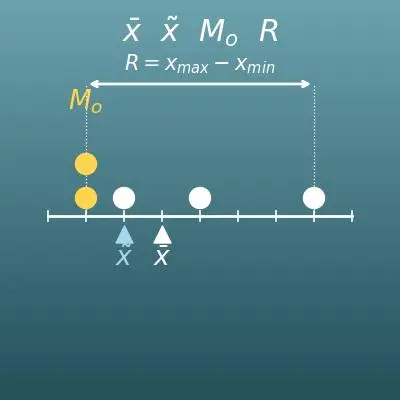
| measure of center | A single number that sums up where the data is centered. The mean, the median and the mode are the most common ones. |
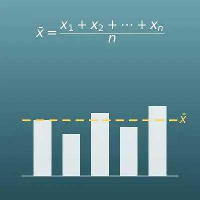
| mean | All the data values added up and divided by the number of values. From a frequency table, it is estimated by sum of (midpoint × frequency) ÷ total frequency. |
| median | The value exactly in the middle when the data is sorted from smallest to largest. With an even number of values, it is the mean of the two middle values. With a frequency table, you use the cumulative frequency to find which class the median is in. |
| mode | The value that appears most often. With a frequency table, the midpoint of the class with the highest frequency (the modal class) is taken as the mode. |
| raw data | The individual values just as they were measured, before being summarized. Organizing raw data into a frequency table makes the overall picture easier to see, but the information about each individual value is lost. |
Good to know before you start
Here is what helps you use the calculation on this page with real understanding, not just by pressing the button.
If you get stuck, going back to review these topics is the fastest way forward.
| Inequalities with ≤ and < (Grade 6) |
|
| The mean (Grade 6) |
|
| Ratios and percents (Grade 6) |
|
| Fractions and decimals (Grades 4–6) |
|
| Measures of center (Grade 6) |
|
How to calculate it in Excel
| Frequency of a class f | 6 |
| Total frequency n | 20 |
| Relative frequency r = f ÷ n | =B1/B2 |
| Lower limit of the class a | 10 |
| Upper limit of the class b | 15 |
| Midpoint m = (a + b) ÷ 2 | =(B1+B2)/2 |
| Midpoint 1 (0 to under 5) | 2.5 |
| Midpoint 2 (5 to under 10) | 7.5 |
| Midpoint 3 (10 to under 15) | 12.5 |
| Midpoint 4 (15 to under 20) | 17.5 |
| Midpoint 5 (20 to under 25) | 22.5 |
| Midpoint 6 (25 to under 30) | 27.5 |
| Frequency 1 | 1 |
| Frequency 2 | 5 |
| Frequency 3 | 6 |
| Frequency 4 | 4 |
| Frequency 5 | 3 |
| Frequency 6 | 1 |
| Sum of (midpoint × frequency) | =SUMPRODUCT(B1:B6,B7:B12) |
| Total frequency n | =SUM(B7:B12) |
| Estimated mean | =B13/B14 |
| Value 1 | 3 |
| Value 2 | 5 |
| Value 3 | 8 |
| Value 4 | 12 |
| Value 5 | 14 |
| Value 6 | 17 |
| Value 7 | 22 |
| Value 8 | 26 |
| Frequency of 0 to under 5 | =COUNTIFS(B1:B8,">=0",B1:B8,"<5") |
| Frequency of 5 to under 10 | =COUNTIFS(B1:B8,">=5",B1:B8,"<10") |
| Frequency of 10 to under 15 | =COUNTIFS(B1:B8,">=10",B1:B8,"<15") |
The first table is an example of relative frequency, and the answer is 0.3. The second table is an example of a class midpoint, and the answer is 12.5.
The third table estimates the mean for the calculator example on this page (commute times of 20 students). SUMPRODUCT is a function that multiplies matching cells and adds the results, so it gives the sum of (midpoint × frequency) in one step. The answer is 14.
The fourth table counts the frequency of each class from raw data. COUNTIFS is a function that counts the cells that meet conditions. Put the two conditions "10 or more" and "less than 15" side by side, and you get the frequency of that class.
How to calculate it in Google Sheets
| Frequency of a class f | 6 |
| Total frequency n | 20 |
| Relative frequency r = f ÷ n | =B1/B2 |
| Lower limit of the class a | 10 |
| Upper limit of the class b | 15 |
| Midpoint m = (a + b) ÷ 2 | =(B1+B2)/2 |
| Midpoint 1 (0 to under 5) | 2.5 |
| Midpoint 2 (5 to under 10) | 7.5 |
| Midpoint 3 (10 to under 15) | 12.5 |
| Midpoint 4 (15 to under 20) | 17.5 |
| Midpoint 5 (20 to under 25) | 22.5 |
| Midpoint 6 (25 to under 30) | 27.5 |
| Frequency 1 | 1 |
| Frequency 2 | 5 |
| Frequency 3 | 6 |
| Frequency 4 | 4 |
| Frequency 5 | 3 |
| Frequency 6 | 1 |
| Sum of (midpoint × frequency) | =SUMPRODUCT(B1:B6,B7:B12) |
| Total frequency n | =SUM(B7:B12) |
| Estimated mean | =B13/B14 |
| Value 1 | 3 |
| Value 2 | 5 |
| Value 3 | 8 |
| Value 4 | 12 |
| Value 5 | 14 |
| Value 6 | 17 |
| Value 7 | 22 |
| Value 8 | 26 |
| Frequency of 0 to under 5 | =COUNTIFS(B1:B8,">=0",B1:B8,"<5") |
| Frequency of 5 to under 10 | =COUNTIFS(B1:B8,">=5",B1:B8,"<10") |
| Frequency of 10 to under 15 | =COUNTIFS(B1:B8,">=10",B1:B8,"<15") |
How to calculate it in Python
from fractions import Fraction

# raw data (example: commute times of 20 students, in minutes)
data_values = [5, 12, 8, 14, 3, 22, 15, 9, 11, 26,
               7, 14, 19, 6, 13, 24, 10, 16, 21, 18]
class_width = Fraction(5)   # class width
first_lower = Fraction(0)   # lower limit of the first class

data_values = [Fraction(v) for v in data_values]
class_count = max(int((v - first_lower) / class_width) for v in data_values) + 1

# put each value into its class (lower limit included, upper limit not included)
freqs = [0] * class_count
for v in data_values:
    freqs[int((v - first_lower) / class_width)] += 1

total = sum(freqs)
mid_times_freq_sum = Fraction(0)
print("Class / Midpoint / Frequency / Relative frequency")
for i, f in enumerate(freqs):
    lower = first_lower + i * class_width
    upper = lower + class_width
    midpoint = (lower + upper) / 2
    mid_times_freq_sum += midpoint * f
    print(f"{lower} to under {upper} / {float(midpoint)} / {f} / {float(Fraction(f, total))}")

estimated_mean = mid_times_freq_sum / total
print(f"Estimated mean (fraction): {estimated_mean}")
print(f"Estimated mean (decimal): {float(estimated_mean)}")
print(f"Mean of the raw data: {float(sum(data_values) / len(data_values))}")
How to write it in LaTeX and other math languages (copy and paste)
r = f ÷ n
r = \dfrac{f}{n}
<math xmlns="http://www.w3.org/1998/Math/MathML" display="block">
  <mrow>
    <mi>r</mi>
    <mo>=</mo>
    <mfrac><mi>f</mi><mi>n</mi></mfrac>
  </mrow>
</math>
r = f/n
r = f/n
r := f/n;
r = f/n;
r = f/n
m = (a + b) ÷ 2
m = \dfrac{a + b}{2}
<math xmlns="http://www.w3.org/1998/Math/MathML" display="block">
  <mrow>
    <mi>m</mi>
    <mo>=</mo>
    <mfrac>
      <mrow><mi>a</mi><mo>+</mo><mi>b</mi></mrow>
      <mn>2</mn>
    </mfrac>
  </mrow>
</math>
m = (a + b)/2
m = (a + b)/2
m := (a + b)/2;
m = (a + b)/2;
m = (a + b)/2
x̄ = (m₁×f₁ + m₂×f₂ + … + mₖ×fₖ) ÷ n
\bar{x} = \dfrac{m_1 f_1 + m_2 f_2 + \cdots + m_k f_k}{n}
<math xmlns="http://www.w3.org/1998/Math/MathML" display="block">
<mrow>
<mover><mi>x</mi><mo>¯</mo></mover>
<mo>=</mo>
<mfrac>
<mrow>
<msub><mi>m</mi><mn>1</mn></msub><msub><mi>f</mi><mn>1</mn></msub>
<mo>+</mo>
<msub><mi>m</mi><mn>2</mn></msub><msub><mi>f</mi><mn>2</mn></msub>
<mo>+</mo><mo>⋯</mo><mo>+</mo>
<msub><mi>m</mi><mi>k</mi></msub><msub><mi>f</mi><mi>k</mi></msub>
</mrow>
<mi>n</mi>
</mfrac>
</mrow>
</math>
bar x = (m_1 f_1 + m_2 f_2 + cdots + m_k f_k)/n
Total[m*f]/Total[f]
xbar := add(m[i]*f[i], i = 1..k)/n;
xbar = sum(m.*f)/sum(f);
x̄ = (m_1 f_1 + m_2 f_2 + … + m_k f_k)/n
How to have ChatGPT do the calculation
You are a calculation assistant for statistics. Do the following calculation by actually running Python code, and base your answer only on the numbers from the execution result (do not answer by mental math or guessing).

Make a frequency distribution table for the following data, using classes that start at a lower limit of 0 with a class width of 5 (each class includes its lower limit and excludes its upper limit).
Data: 5, 12, 8, 14, 3, 22, 15, 9, 11, 26, 7, 14, 19, 6, 13, 24, 10, 16, 21, 18
Show each of the following:
1. The frequency distribution table (class, midpoint, frequency, relative frequency, cumulative frequency, cumulative relative frequency)
2. The mean estimated from the class midpoints (both as a fraction in lowest terms and as a decimal)
3. The mode and the class that contains the median
4. The mean calculated directly from the raw data, and how far the estimate is from it

In Python, calculate exactly with the fractions module in the standard library, and show the formulas you used and the numbers from the execution result.
How to Use
-
1Enter your numbersType the numbers you want to calculate with into the input fields
-
2CalculatePress the "Calculate" button
-
3Check the resultThe result appears on the spot. The same page also explains the idea behind the calculation and the formula
DataChef Features

No technical knowledge required.
Intuitive and user-friendly operation.

Can be used without registering personal information.

Automatic file deletion by clicking "download".

and rapid file conversion.
No attribution required.
No need to contact us for commercial use permission.
Related Features
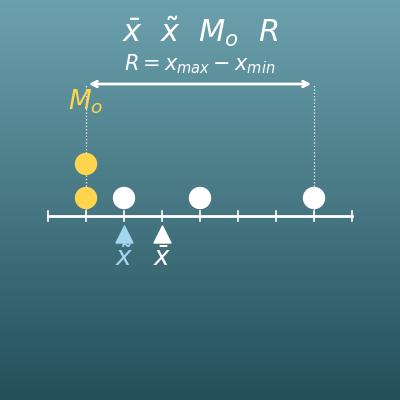
Mean, Median, Mode and Range Calculator
Calculates the mean, median, mode and range of raw data at once, and explains when to use each
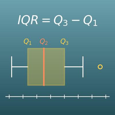
Quartile and Box Plot Calculator (Q1, Q2, Q3, IQR, Outliers)
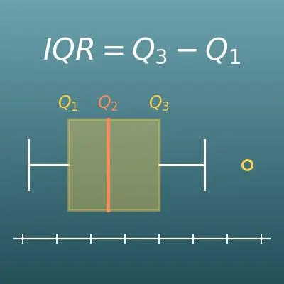
Shows the spread of data with quartiles and a box plot, another tool for looking at a distribution besides the histogram
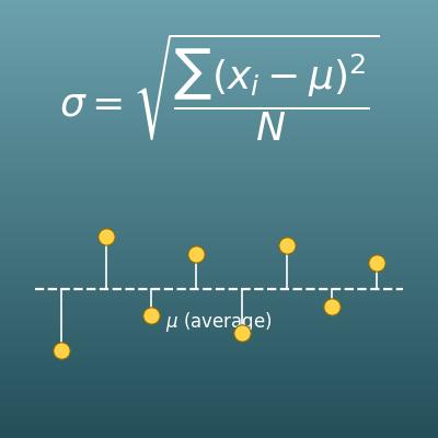
Standard Deviation Calculator for Population and Sample
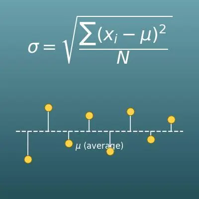
Sums up how spread out data is in one number (the standard deviation), with steps for the variance and deviations